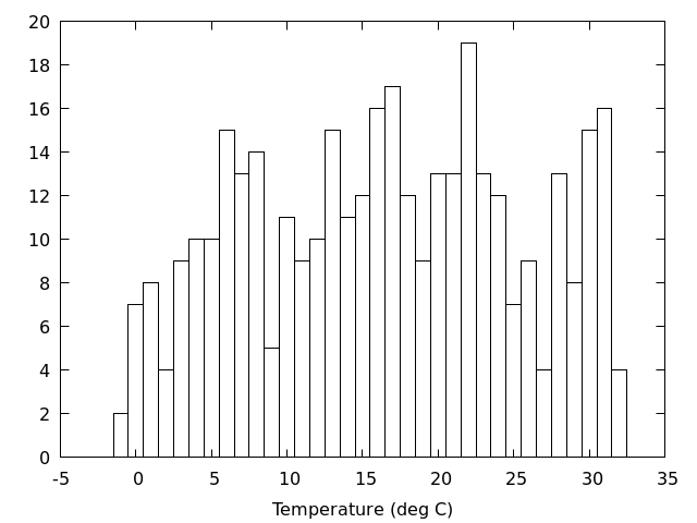
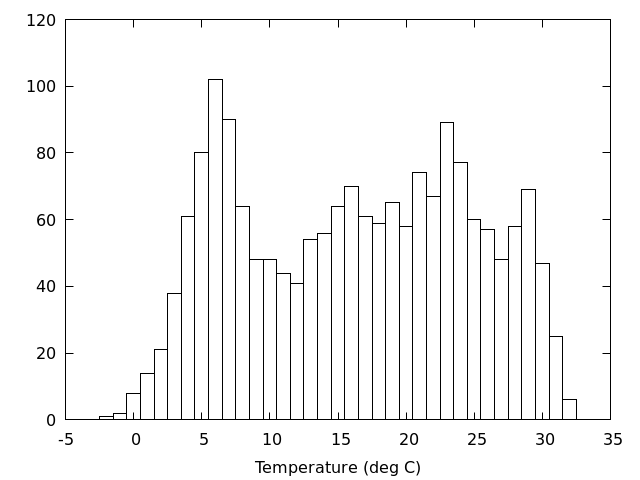
アメダスのデータを使って,日平均気温の頻度分布を図にしてみる.
アメダスのデータ(2018年)
/home/atmos/ipesc/sample/amedas/Okayama_Okayama_2018.csv
データは4列からなり,1列目から順番に,日付,日平均気温,日最高気温,日最低気温
CSVなので
gnuplot> set datafile separator ','
区間を区切って頻度を数えるための関数を定義する
gnuplot> bin(x,width)=width*(floor(x/width+0.5))
頻度分布図を描く
gnuplot> width=1.0
gnuplot> set boxwidth width
gnuplot> plot 'Okayama_Okayama_2018.csv' using (bin($2,width)):(1.0) smooth frequency with boxes
ここで,width は区間の幅で,上の例だと1度刻みで区間を区切る.
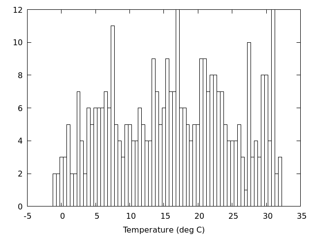
区間の幅を変更するときは,
gnuplot> width=0.5
gnuplot> set boxwidth width
gnuplot> replot
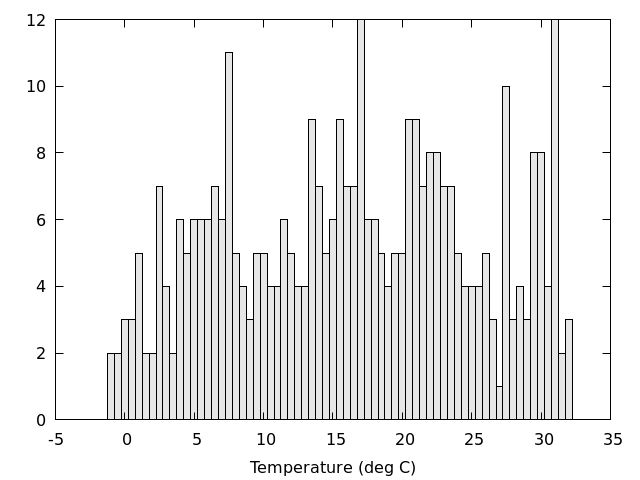
棒を塗りつぶす
gnuplot> plot 'Okayama_Okayama_2018.csv' using (bin($2,width)):(1.0) smooth frequency with boxes fillstyle transparent solid 0.1
上の例で定義した
gnuplot> bin(x,width)=width*(floor(x/width+0.5))
は,-0.5 から 0.5 を 0.0 にまとめ,0.5 から 1.5 を 1.0 にまとめ,というような区切り方をする.
これを
gnuplot> bin(x,width)=width*(floor(x/width))+width/2.0
に変更すると,0.0 から 1.0 を 0.5 にまとめ,1.0 から 2.0 を 1.5 にまとめ,というような区切り方になる.
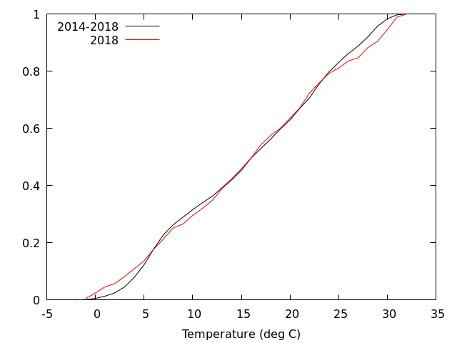
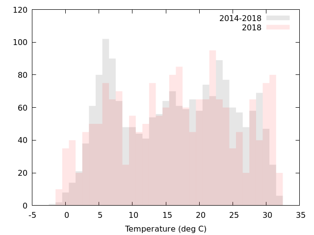
重ねて描いてみると,2018年は平年より寒い日と暑い日が多かったように見える.
gnuplot> plot 'Okayama_Okayama_2018.csv' using (bin($2,width)):(1.0) smooth cumulative
全体を 1 に規格化するなら,using の 1.0 をデータ数分の 1 にする.
gnuplot> plot 'Okayama_Okayama_2018.csv' using (bin($2,width)):(1.0/1826.0) smooth cumulative